ATD is a full-service design collective based in Davis, CA. When they came to us, they had the work — striking brand identities, product photography, creative campaigns for clients across the region — but no site to show any of it. Their portfolio lived in DMs and PDF decks.
The ask was simple: build something as considered as the work inside it.
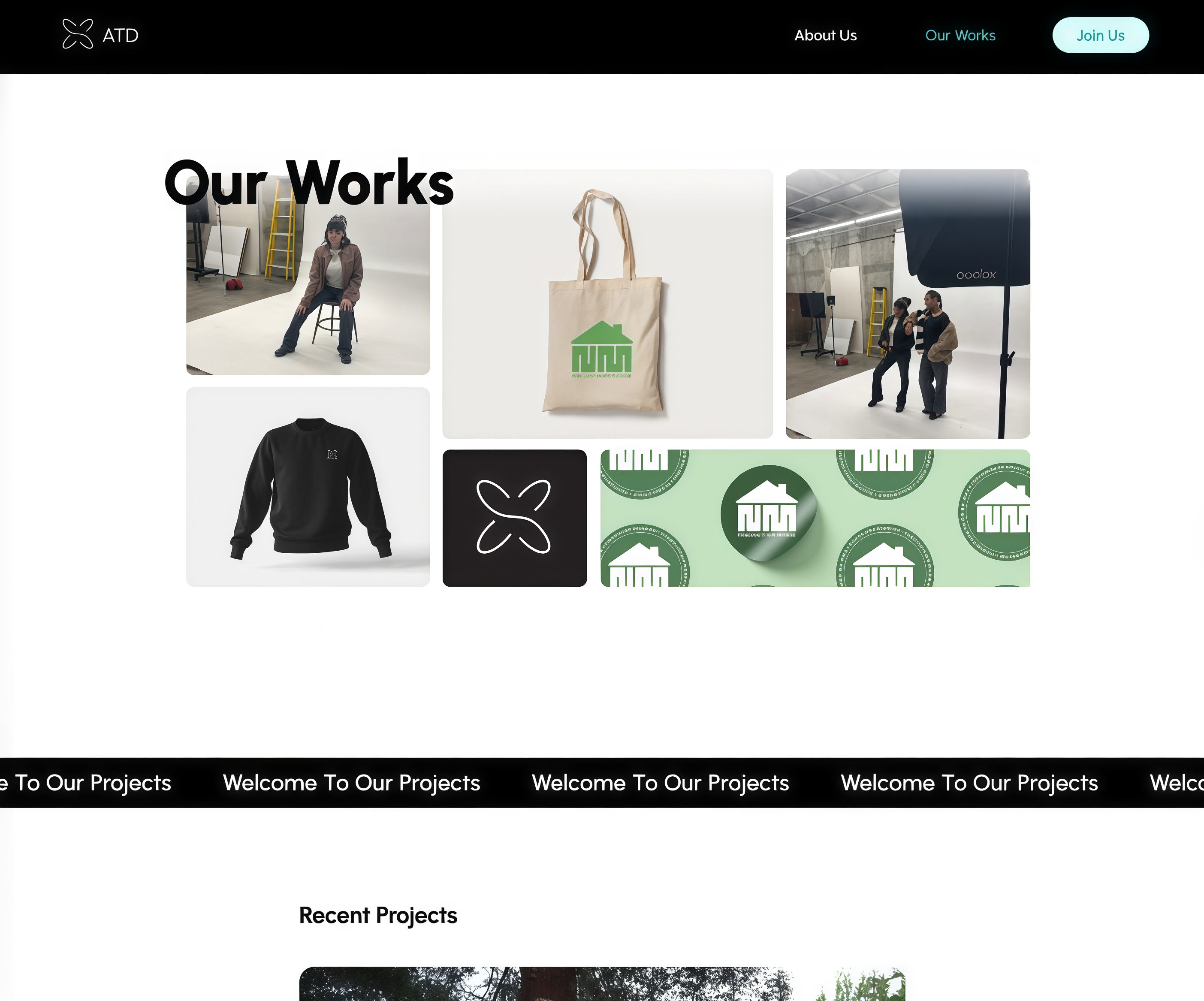
We built around the work. The design language is deliberately spare — black, white, one green accent pulled from their brand mark — so nothing competes with the client projects inside. Navigation stays minimal: three links, no dropdown menus, no friction between landing and portfolio.
The “Our Works” section uses a masonry grid that stacks differently at every viewport size. Each visit feels slightly different without any randomization logic — it’s just physics. We kept load time lean so the photography appears instantly, not progressively.
ATD launched with a site that feels as considered as the brands they create. New client inquiries now arrive with context — prospects have already seen the portfolio and know what to expect before the first call. The collective’s brand identity is consistent across every touchpoint for the first time.